Sirkus Finlandia
WEBSITES
Starting point:
Circus arts have long and international traditions. The visual design of the new website was to evoke a vintage atmosphere and a sense of history, while still maintaining a modern and lively impression. The circus atmosphere comes alive, and magic happens when the circus arrives to town
Solution:
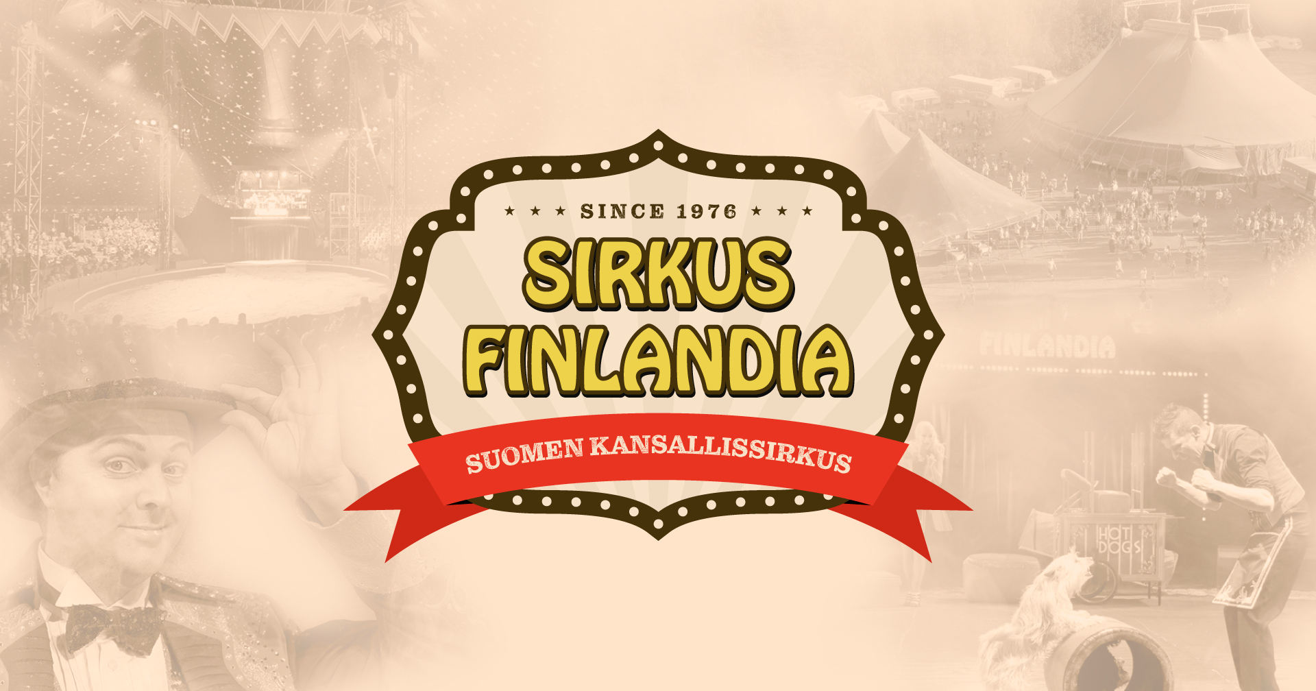
In the creative design process, we aimed to find a playful execution that would delight both children and adults with its surprises. The visual implementation features layers: the background reveals the circus’s history through black-and-white photographs arranged in a wallpaper-like fashion. The headings creatively combine nostalgic and modern fonts. The homepage invites visitors to step into the circus’s glittering magical world.
The site was enlivened with animations that reward the observant circus fan. Throughout the site, two circus clowns follow the visitor. By clicking on the flashing nose of one clown, the propeller on its hat starts to spin and lifts the headpiece into the air. The second clown waves the Finnish flag from its swaying top hat. Above the line of stars, a small cyclist rides on a unicycle along a tightrope, disappearing behind the circus tents. The wind flutters the flags on the tents’ roofs.
The website was implemented using WordPress, making it easy for the client to maintain the content themselves.
Tutustu sivustoon: https://sirkusfinlandia.fi/en/home/
Enhancing the Circus Experience with Animations
In conjunction with the website project, a 15-second promotional animation was also created, featuring dancing clown characters returning from the beach vacation to the arena.
Case facts:
ARE YOU IN NEED OF A SIMILAR SOLUTION?
Contact us
"*" indicates required fields

